Bjork here, checking in for the monthly traffic and income report. Quick story… We were hanging out at our friends’ house this weekend and they were showing us clips from the movie The Intern. We weren’t actually watching the movie, just the highlights. Kind of like Sports Center, but with a movie instead of a football game. Here’s the basic premise: Anne Hathaway’s character is the founder of a successful e-commerce company. The company has 200+ employees and a sprawling office. And the company is less than two years old. You hear about explosive growth startups like this all the time. I love reading about them, I love learning about them, and I love watching highlights from fictional Hollywood movies about them. It’s 100% fascinating and 100% inspiring. But one thing I found myself thinking while watching some of the clips is how different the story of a business can be. The story of Pinch of Yum doesn’t in any way parallel Anne Hathaway’s company in The Intern, and your story doesn’t have to either. We’ve taken risks, but not huge risks. We’ve grown, but not exponentially. We’ve spent money, but we’ve never taken on debt or outside capital. It’s always been a long-term game for us. Slow, steady, and consistent. Showing up every day, finding out what works, what doesn’t work, and then doing more of what works and less of what doesn’t work. These reports are about sharing those things with you. The things that are working, the things that aren’t working, and the things that we’re changing because of what we’ve learned. We don’t have backgrounds in computer science (teaching for Lindsay and non-profit for me), we don’t live in Silicon Valley (St. Paul, MN…brrrrr), and we don’t know how to code (although I’d like to think that I can). These reports are a testament to the fact that you don’t need to “fit the mold” in order to build something (a business, a non-profit, a community) online. We’ve done these monthly reports for over four years now. The first one was published on August 11th of 2011. You can check it out all of the past reports on this page. Let’s jump into the numbers for December. A quick note: Some of the links below are affiliate links. All of the products listed below are products and services we’ve used before. If you have any questions about any of the income or expenses you can leave a comment and I’ll do my best to reply.
Income
Expenses
If you’re interested in learning more about some of the ways that you can monetize a food blog, we encourage you to download this free ebook, “16 Ways to Monetize Your Food Blog,” from our sister site, Food Blogger Pro!
Traffic Totals
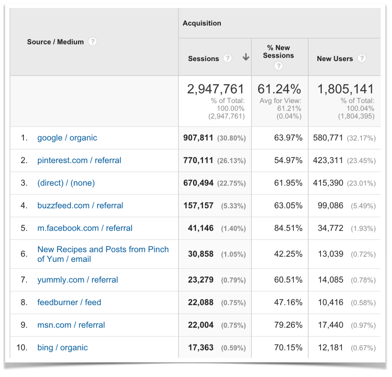
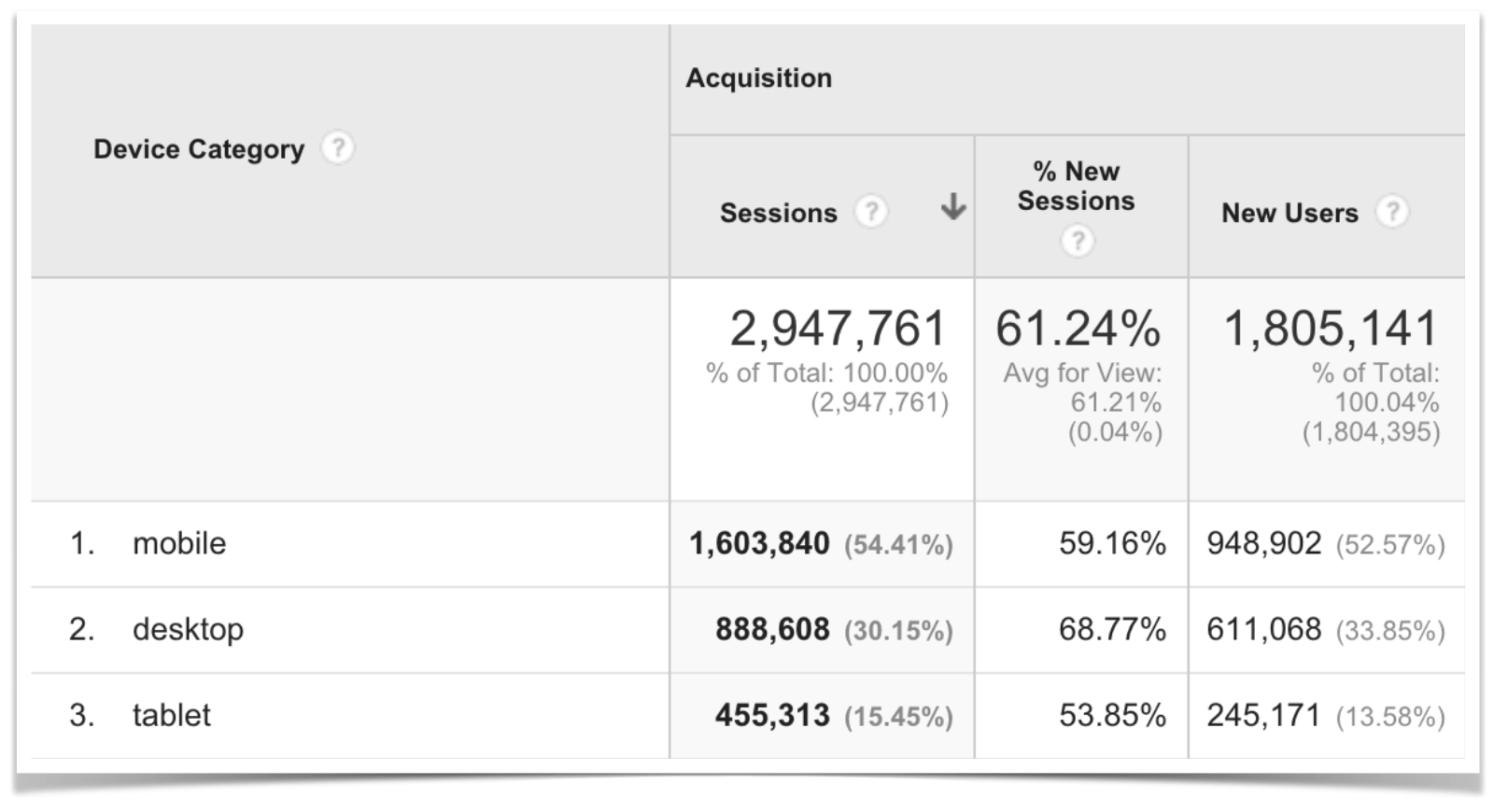
Below are some screenshots from Google Analytics. You can click on these images to view a larger size.
Traffic Overview
Top Ten Traffic Sources
Mobile Vs. Desktop Vs. Tablet
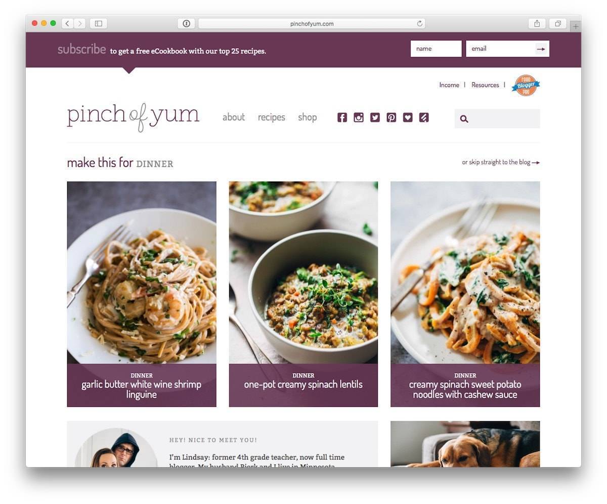
The Pinch Of Yum Redesign
The biggest change we recently made is the Pinch of Yum redesign. I wanted to take time in this report to talk about the updates we made, why we made them, the impact that they’ve had, and the changes we’ll be making in the future based on what we’ve learned so far. But first, a quick walk down memory lane…
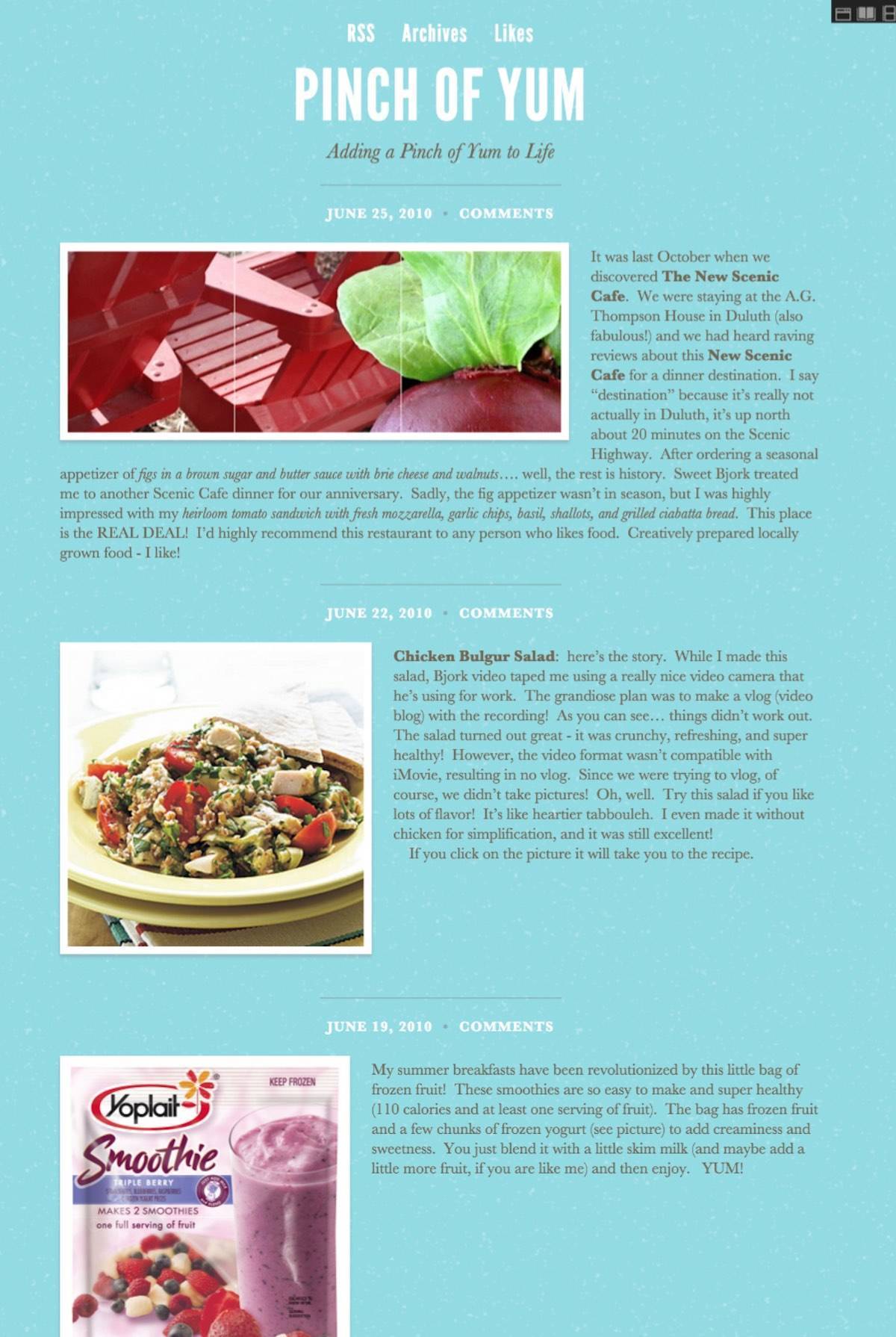
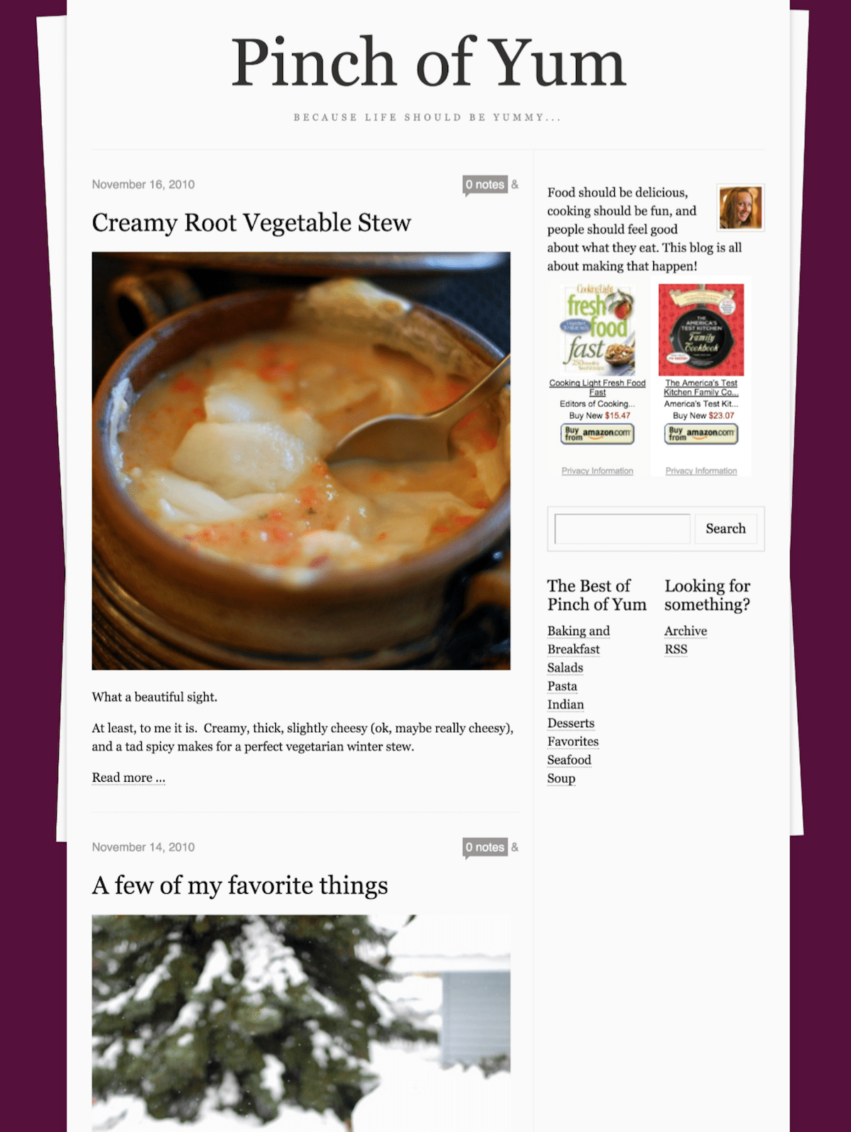
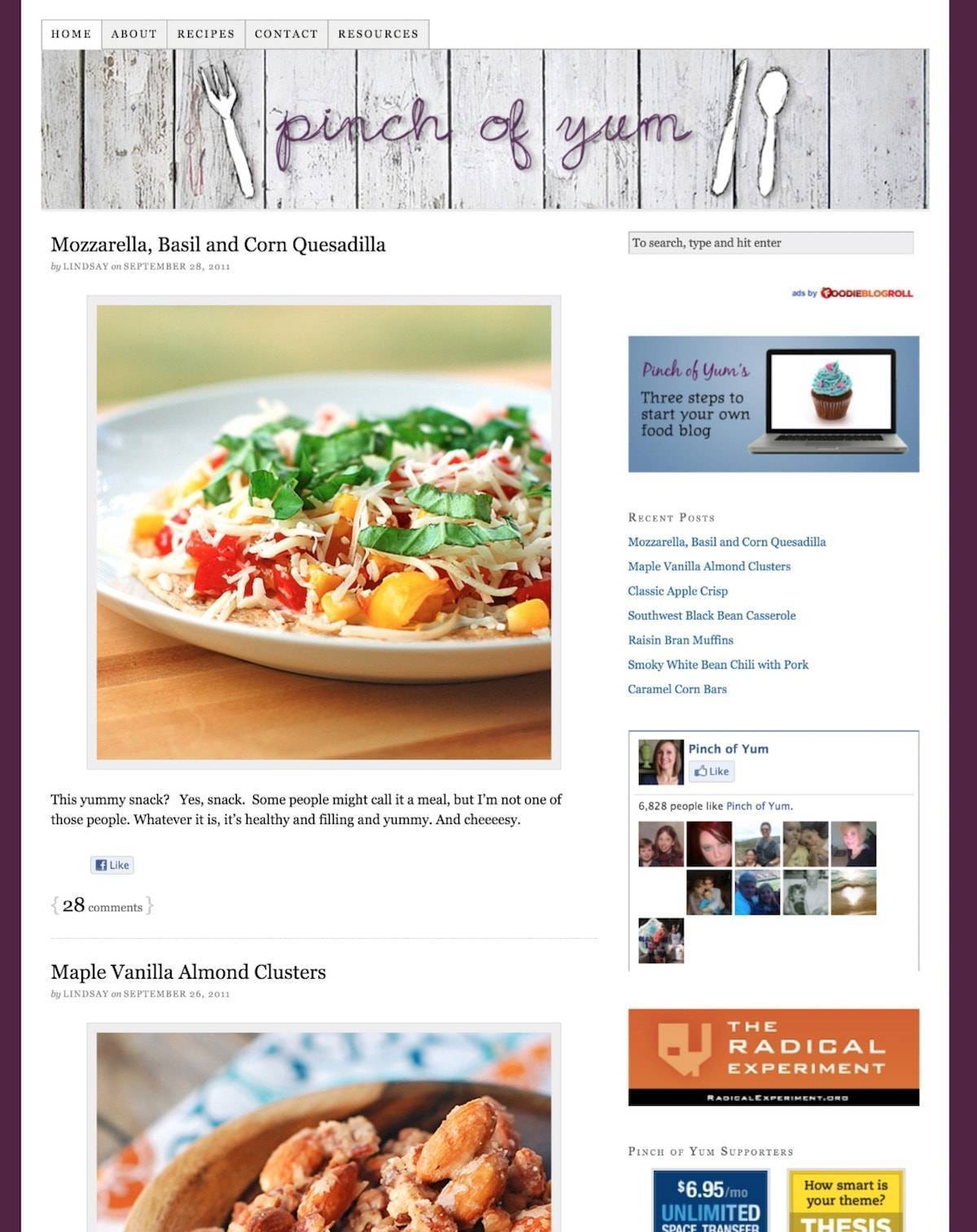
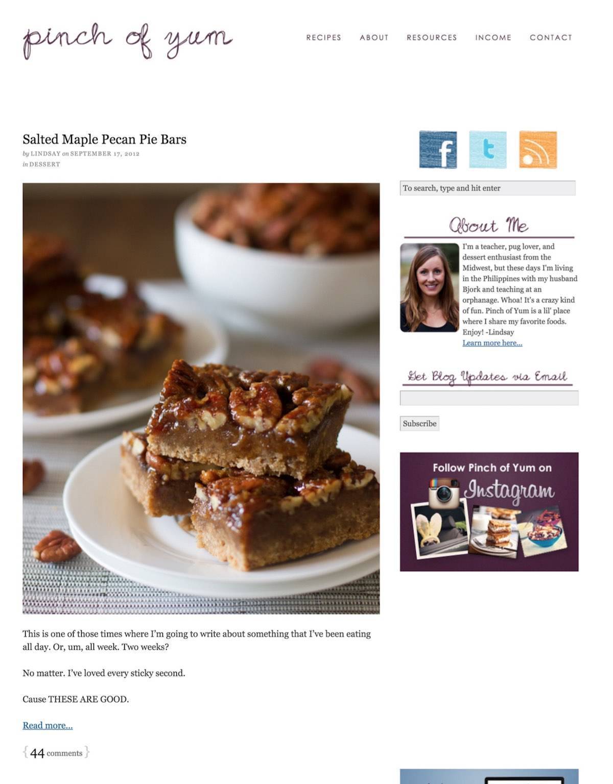
Pinch Of Yum Through The Years
I pulled these screenshots from Pinch of Yum’s page on archive.org. You can click on any of the images to see a full PDF screenshot of the page. These screenshots represent the major design changes we’ve had with Pinch of Yum throughout the 5+ years that we’ve been blogging.
1. June 27th, 2010
The first-ever Pinch of Yum design.Platform: Tumblr
2. November 20th, 2010
The first time we gave any thought to design.Platform: Tumblr
3. September 29th, 2011
Switch to WordPress. First time paying for any type of design or theme (somewhere around $100 for the Thesis Theme).Platform: WordPressTheme: Self-designed Thesis Theme
4. September 19th, 2012
Minor design changes (we did these on our own).Platform: WordPressTheme: Self-designed Thesis Theme
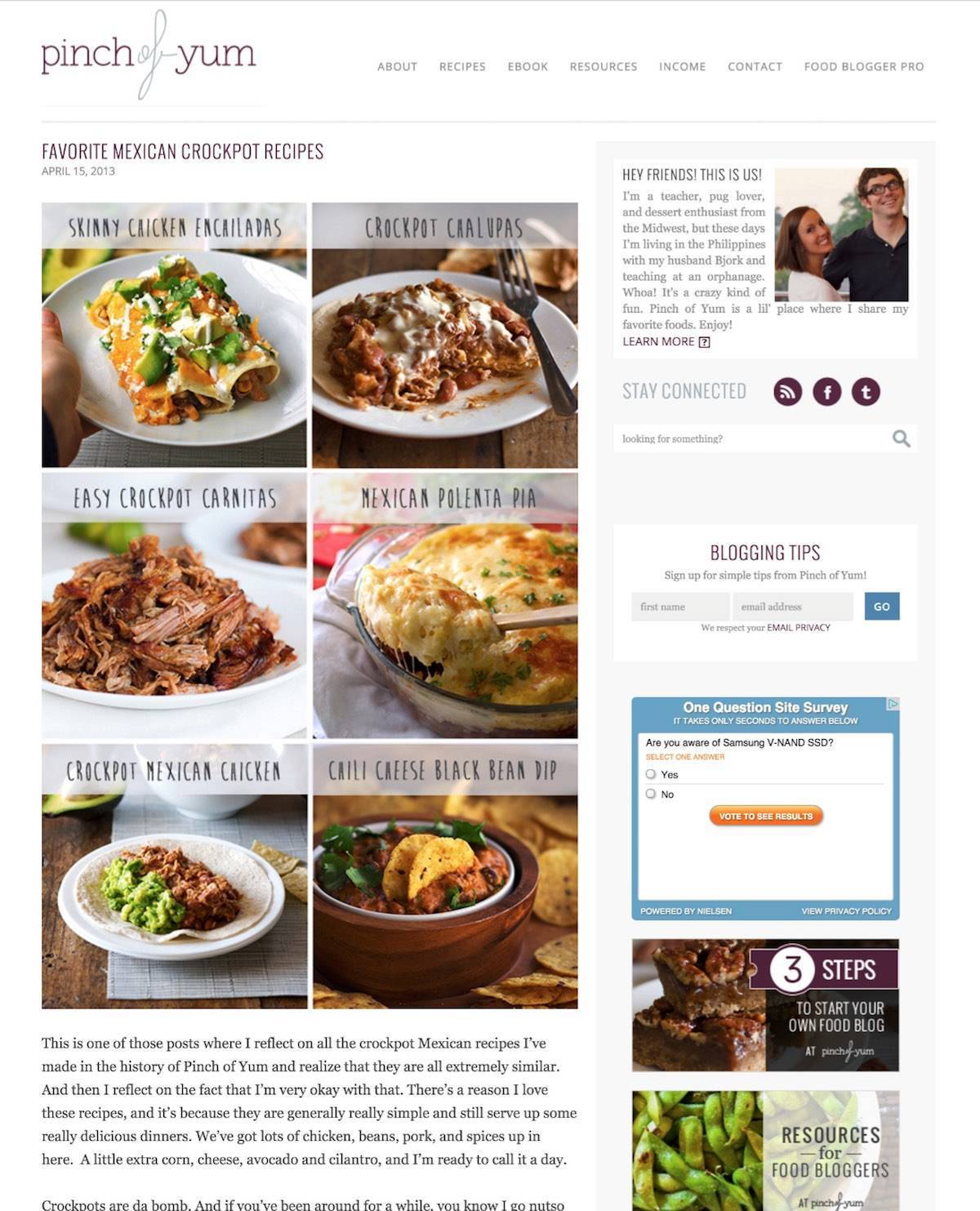
5. April 15th, 2013
First time paying for a professional redesign.Platform: WordPressTheme: Genesis with a custom Child Theme
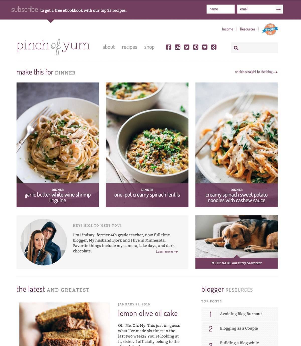
6. January 26th, 2016
Second time paying for a professional redesign. Working with a designer (who designed in Photoshop) and a developer that handled all of the development.Platform: WordPressTheme: Genesis with a custom Child Theme
The Redesign: What We’Re Learning
1. Email Opt-In
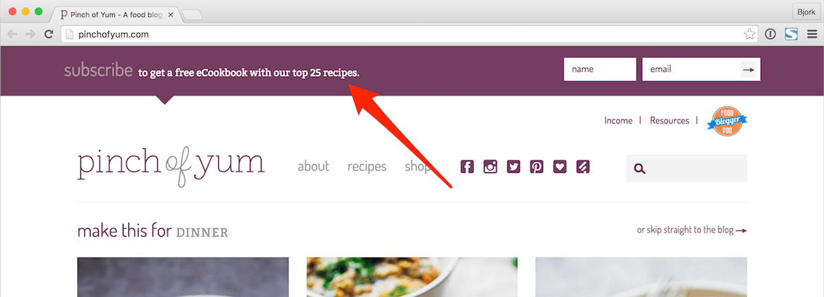
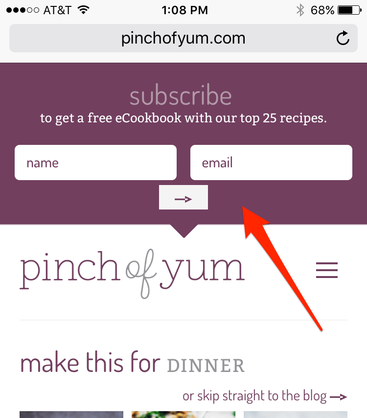
One of the areas we’re focusing on in 2016 is email marketing. The first step we’re taking in improving email subscriptions is making sure that we have a clear opt-in for visitors on mobile devices. You can see this area at the top of the page on both desktop and mobile screens. We’re hooking all email opt-ins into ActiveCampaign.
Email Opt-In (Desktop)
Email Opt-In (Mobile)
The Good with Email Opt-In
It’s easy to see and designed well so it matches the look and feel of the theme. We’re not using a third party plugin so the opt-in loads quickly and doesn’t require any extra scripts. It shows up prominently on mobile.
To Improve with Email Opt-In
A free eCookbook doesn’t really do much for people. While the opt-in is an improvement over what we had in the past it’s still a bit too weak of an offering. The next type of opt-in we’ll be implementing is something that the folks at LeadPages call a Content Upgrade. The idea with a Content Upgrade is that you’re offering a focused and specific bonus or incentive that aligns with the content of the blog post.
2. “Static” Homepage
Food blogs are unique in that their content is (for the most part) evergreen, meaning a recipe you publish today can still be valuable and relevant two years from now. We’ve switched to a “static” home page (vs. the blog page as a home page), which allows us to highlight past content that might otherwise get forgotten. “Static” is in quotes because we can still go in and update the content on the home page. The Good with a “Static” Home Page We have more control over the content that we present to visitors. With the previous design we were forced to show the most recent post, but now we can display relevant content for the given season (i.e. soup in the winter or lemonade in the summer).
To Improve with a “Static” Home Page
The home page feels pretty good overall, with the exception of the mobile version. We’re still working on that. We’ll (possibly) be testing some ad spots as the home page is currently running ad-free. We’ll also need to make sure we stay on top of changing the content on the home page so it doesn’t get stale.
3. Continuous Scroll
Continuous scroll means that a visitor never gets to the bottom of a page because new content continually loads as they scroll down. One of the ways that content-driven sites are able to increase their ad revenue is by using continuous scroll to increase ad impressions. Mashable is an example of a site that does this well. We’ve also condensed the comment section and added the option for readers to “load all comments” versus having all of the comments load automatically.
The Good with Continuous Scroll
We have it. 🙂 Condensing the comment section has helped visitors more quickly get into the additional content below a post.
To Improve with Continuous Scroll
The load time for the continuous scroll section is still really slow, leaving some people to assume that they’ve reached the bottom of the page. After fixing the load time issue with the continuous scroll we’ll start introducing ad units in the continuous scroll area.
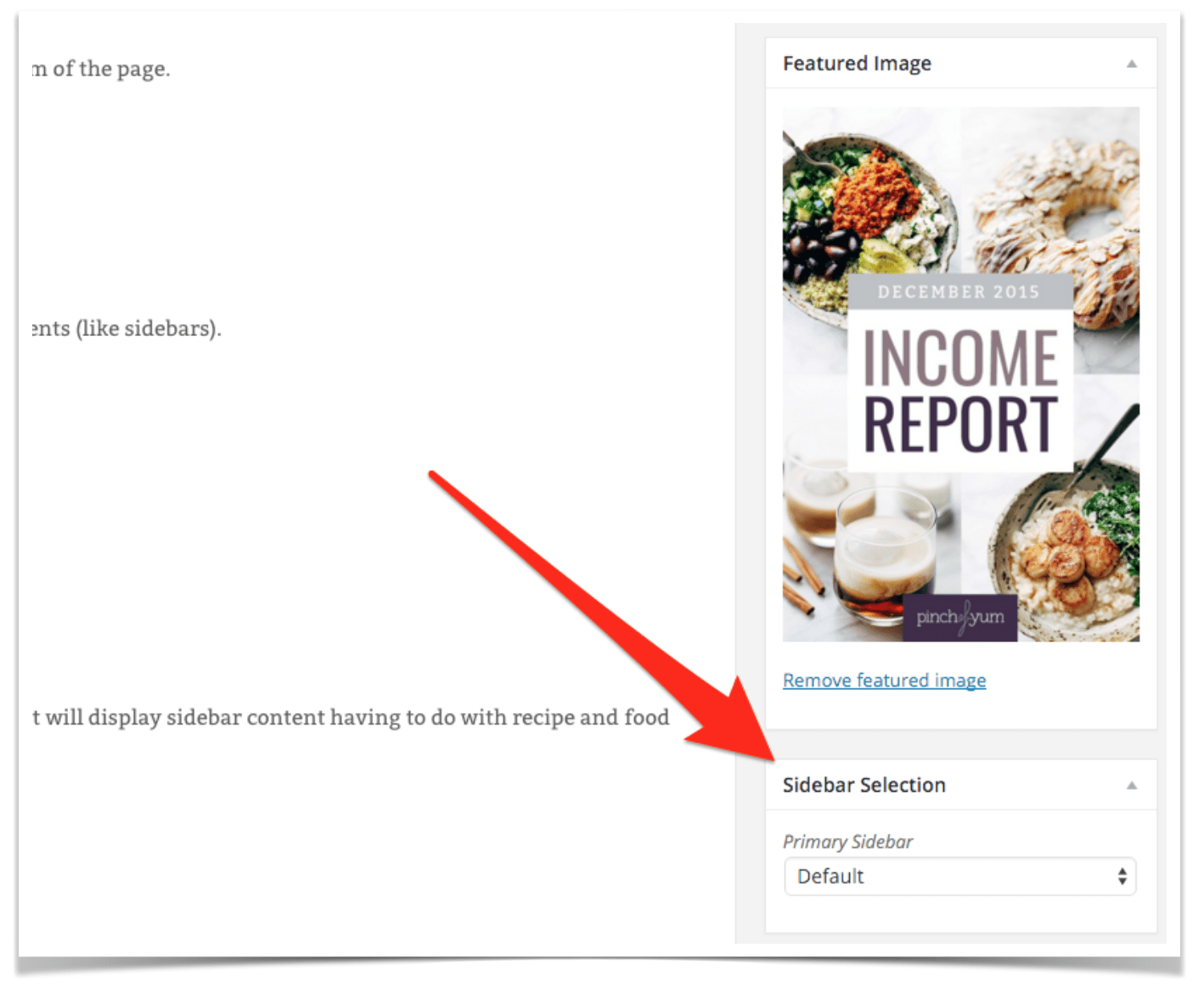
4. Multiple Sidebars
Sidebars are becoming less and less important as the shift to mobile continues to grow. That being said, 32% of Pinch of Yum’s 2015 traffic was desktop, so we’re still paying attention to certain desktop design elements (like sidebars). Having multiple sidebars means that we can pick and choose which sidebar is displayed for which post. We’re using Genesis Simple Sidebars to accomplish this.
The Good with Multiple Sidebars
We’ll be able to display content that is aligned with the type of post that the visitor is reading. For instance, an income report will display sidebar content having to do with blogging and photography, whereas a recipe post will display sidebar content having to do with recipe and food-related content.
To Improve with Multiple Sidebars
We haven’t designed the additional sidebars yet. We only have one. So yeah, that’s a pretty obvious area for improvement.
5. Retina Images
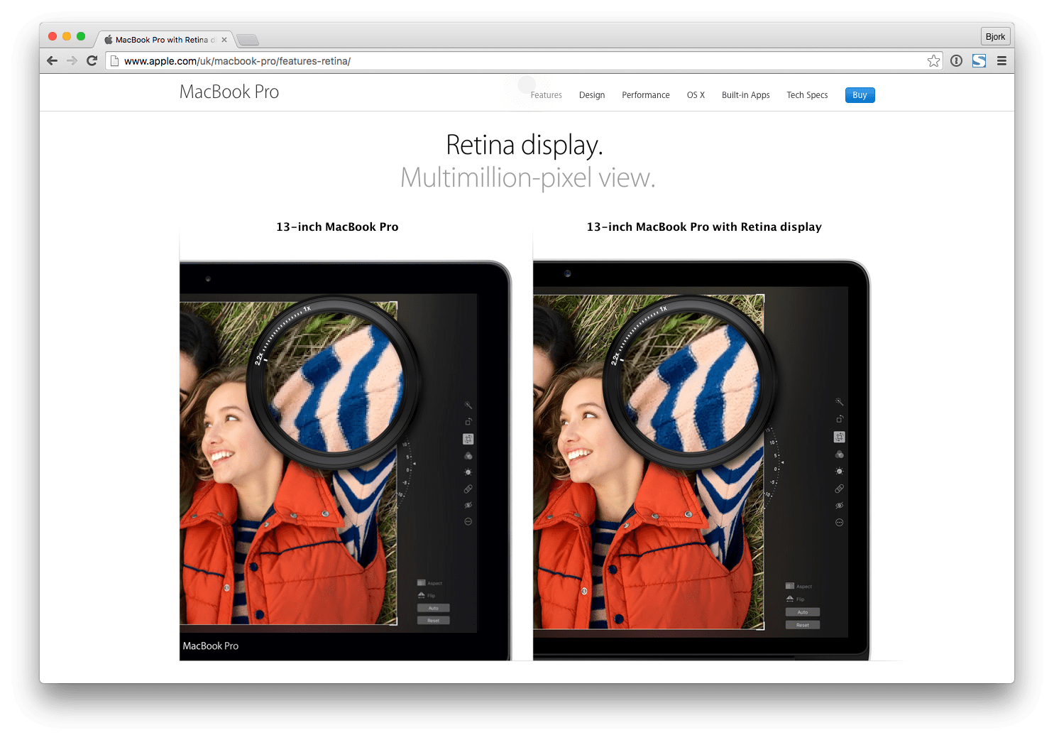
Retina display is a marketing term from Apple. The basic idea is that Retina screens make photos and fonts super crisp. More and more devices, both PC and Apple, have these super high-quality screens. If you have a Retina screen (you can find out here) you’ll know when you see a non-retina image. It looks dull, flat, and a bit pixelated. If you don’t have a retina level screen you won’t notice a difference. We’ve implemented site wide retina images on the new Pinch of Yum design using a new feature in WordPress 4.4.
The Good with Retina Images
The images – both blog post images and thumbnails – are super crisp everywhere on the site. Blog posts. The recipes page. The shop. They all have retina images. So easy on the eyes!
To Improve with Retina Images
This isn’t necessarily something we’ll improve, but there are two things to be aware of when it comes to using high-quality images: speed and cost.
Speed
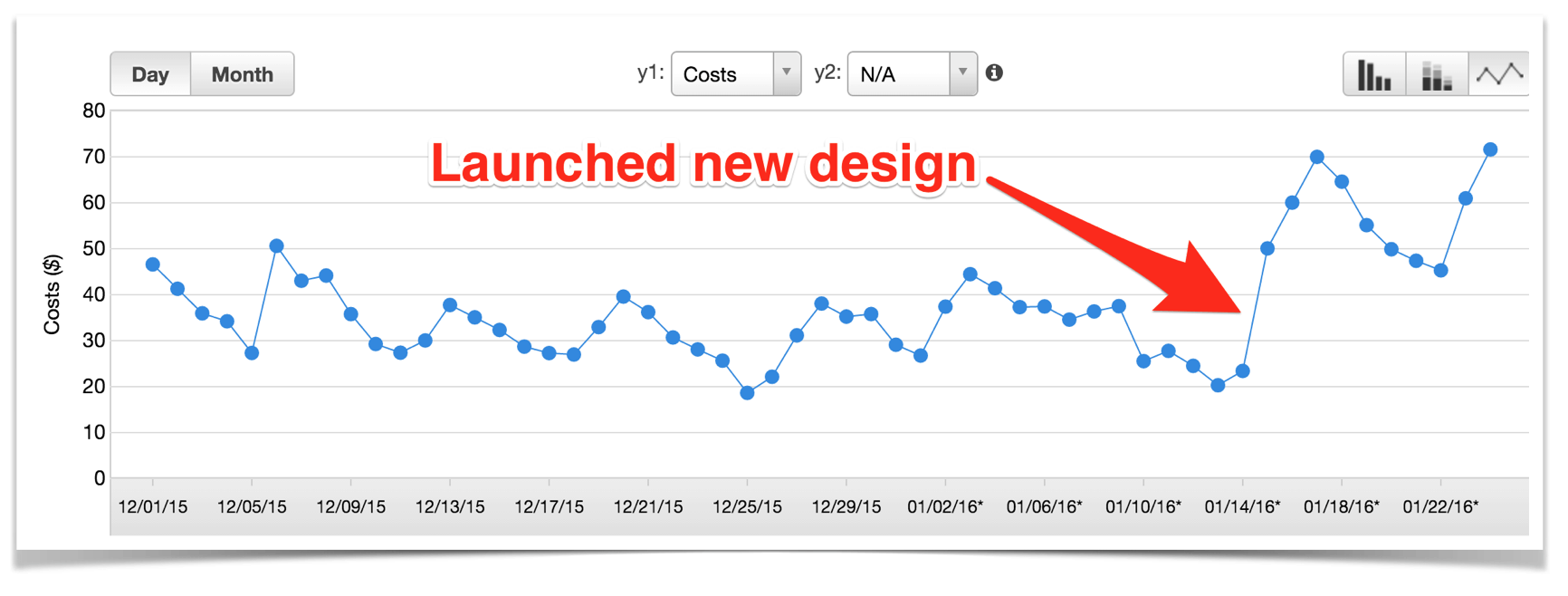
Retina images load slower than “regular” images because they’re a heavier file size. This has the potential to negatively impact user experience and SEO.
Cost
Because the images are larger in size we have to pay more for hosting and serving them.
6. Recipes Page
We wanted to build a simple and easy to use recipe page with the new theme, as it’s one of the most popular pages on the blog. We’re using Facet WP for the recipe page.
The Good with the Recipes Page
Easy and quick filtering of recipes allows users to quickly find the recipe they’re looking for.
To Improve with the Recipes Page
We still have some tweaking to do with the mobile design of this page.
6. Shop Page
We wanted to experiment with having a prominent shop page that directly linked out to affiliate products. We’re using Facet WP for the shop page.
The Good with the Shop Page
Similar to the recipe page, it allows for quick filtering of products and allows users to quickly find a product they’re looking for. It’s also a natural way to integrate affiliate content.
To Improve with the Shop Page
We have a lot of room to improve with the shop page, as the engagement level is relatively lackluster. The biggest issues (I’m assuming) are the name (Shop vs. something like Favorites), the generic images, and the fact that we are not really calling out this portion of the website in any way. You’ll see us continue to experiment with this page throughout the year. Speaking of continuing to experiment…
1% Infinity Applied To Web Design
If you’ve followed along with these reports (the Food Blogger Pro podcast) then you know that we talk a lot about a concept we call 1% Infinity. The basic idea with 1% Infinity is that you make small improvements, every day, forever. Moving forward, we’ll be applying the 1% Infinity mindset to the design and user experience of Pinch of Yum. Instead of big changes every few years (like what we showed in the Pinch of Yum Through the Years section above) we’ll be making small changes on a regular basis, testing them, and then applying what we learned to make it an even stronger site.
One More Thing
We’re tossing around the idea of creating a Pinch of Yum theme + course offering. This would be a good fit for someone that doesn’t want an out-of-the-box, publicly available theme but at the same time doesn’t want to pay $5,000+ for a custom-designed and developed theme. We’re currently in the “gauging interest” stage with this, so if this sounds like something you might be interested in you can sign up here <— Update 10/27/20: We decided to not create a theme as mentioned above, and instead we’ve been focusing on a handful of awesome plugins from our sister site, WP Tasty – a recipe card plugin exclusively for food blogs, a plugin to auto-link keywords and maximize affiliate revenue, and a plugin to optimize your images for SEO and Pinterest. You can check them all out here!
Because Of You
Lindsay and I fully realize that it’s because you – the readers, commenters, silent observers, and share-with-your-friend-ers – that Pinch of Yum is what it is today. Thank you. We so-so-so appreciate you. From the bottom of our Minnesota hearts. Every month we donate a portion of this blog income to the Children’s Shelter of Cebu, an orphanage in Cebu City, Philippines that we know and love. This month we’re donating to the school’s carpet project. It’s not the most exciting fundraising campaign, but carpet in the Philippines is actually a pretty big deal. Carpet helps the school feel warmer and welcoming for the kids, and new carpet is much needed! As a side note, Lindsay and I recently booked our flights to go back to the Philippines in late February of this year! We are really excited to visit the orphanage and our old home, and also have the chance to work on some media projects for the shelter. I’m sure you’ll be seeing more on that from Lindsay when the time comes. 😉
